
 Access
 Publications
 For the Press
Original Plan: Kiyoji TAKASERevisions: Mitsuo KATSUI
The logo of The Sumida Hokusai Museum was finalized based on the design selected as the Grand Prix from 1,634 design plans delivered from home and abroad in response to our public invitation in FY 2009. This logo, which has a sharp and strong form, makes us feel its intensity and energy, as well as conjures up an image of Hokusai’s challenging style seen in his works. On the other hand, arrows of lightning spreading widely and high in the sky represent the philosophy of this museum – disseminating information to the world. This fresh yet dynamic logo is suitable for the museum located in Hokusai’s birthplace. The logo colors are ink black, gray, white and silver. Its main color, ink black, works as a framework in block prints. It brings out other colors with higher intensity, showing its presence.
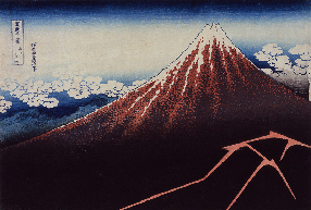
Rainstrom beneath the Summit from the series Thirty-six Views of Mount Fuji
Original Work on Which This Logo Is Based
Lightning drawn at the foot of Mt. Fuji is turned into a logo by giving minimum processing in design. Coal-black rain clouds cover the mountain foot while arrows of lightning spread as if they were slashing the clouds. However, Mt. Fuji stands so high with magnificence as if transcending all these phenomena. A sense of tension outstripping the reality and an overwhelming you-are-there feeling available from this work are partially expressed in this logo.


